
Joob.com
Online travel marketplace
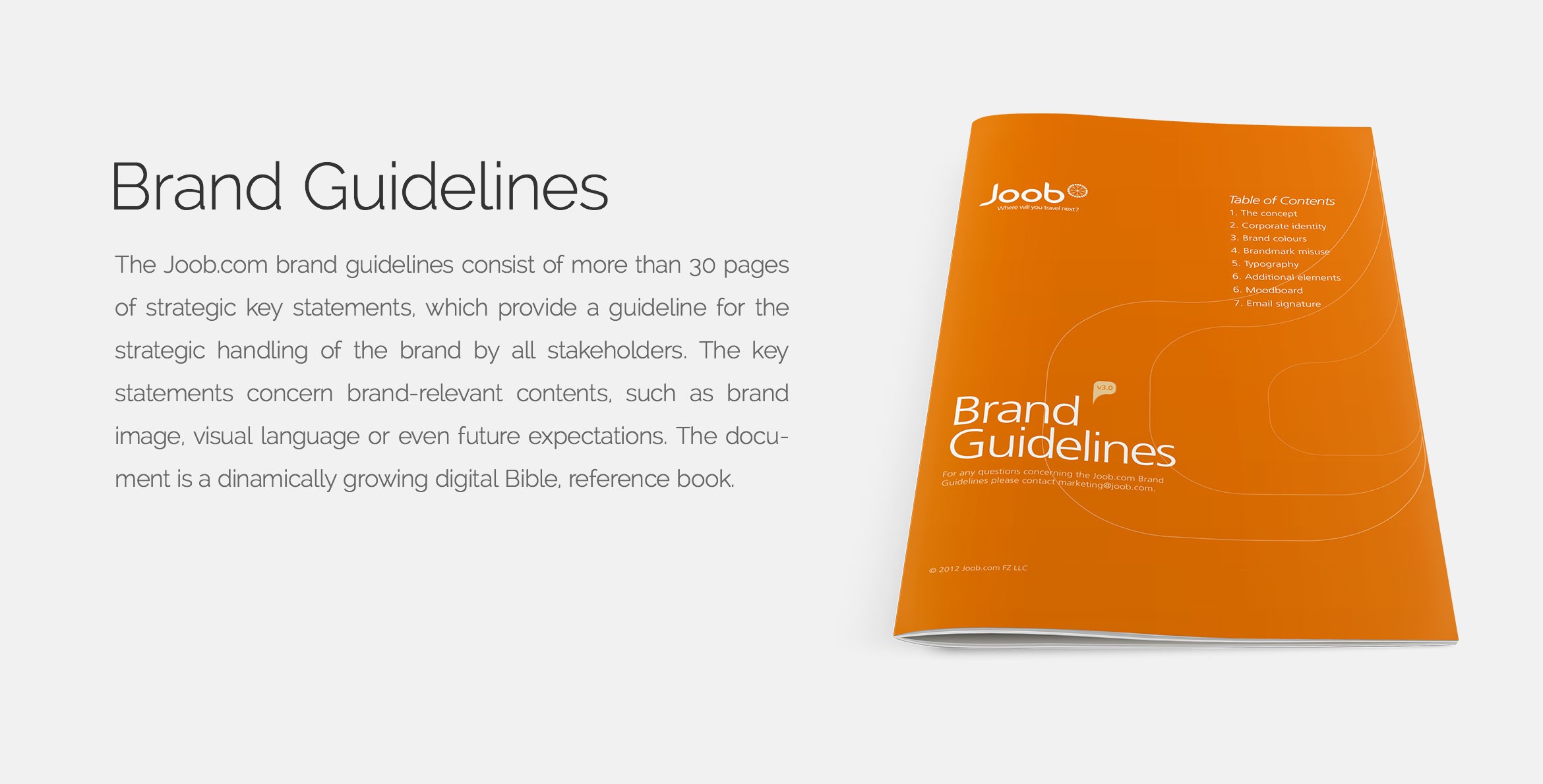
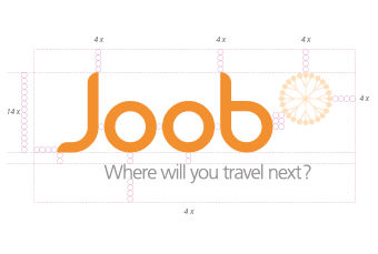
Joob.com was an online travel site, available in Arabic and English. I had the opportunity to work on the startup’s complete brand development. Here are some snapshots from the project from logo design to the final brand booklet.
Client: Joob.com
Role: Brand Development, Art Direction
Type of work: Identity/Branding
Year: 2011
The concept
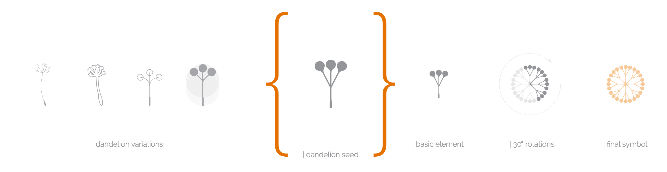
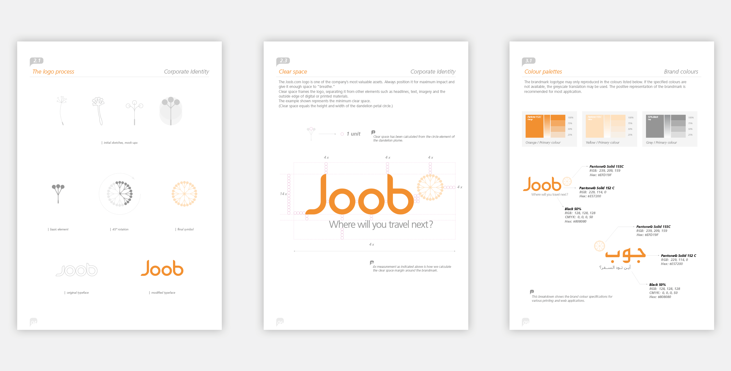
The word “joob” means roaming, wandering in arabic. The challenge was to find a visual metaphor which connects with travel and wandering. I started to built the brand concept around the following keywords: light, discover, adventure and friendly. I carried on thinking by this train of thought when I found the dandelion. The Joob dandelion brandmark is symbolic. While it’s a simple, symmetric, light, funny flower it also “travels” if you blow it.
Evolution of the brandmark
The Joob brandmark's main component was made of simplified dandelion seeds.
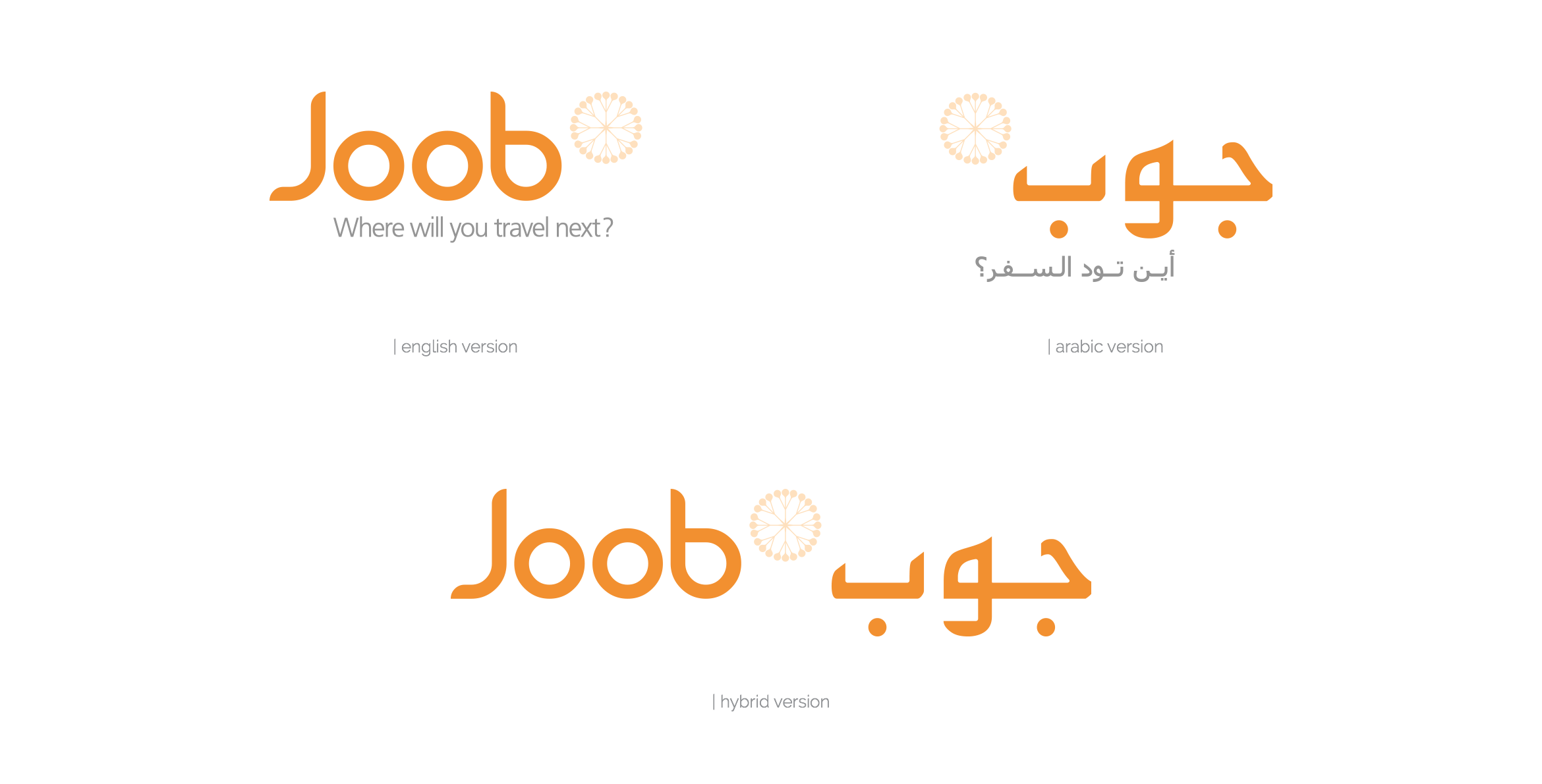
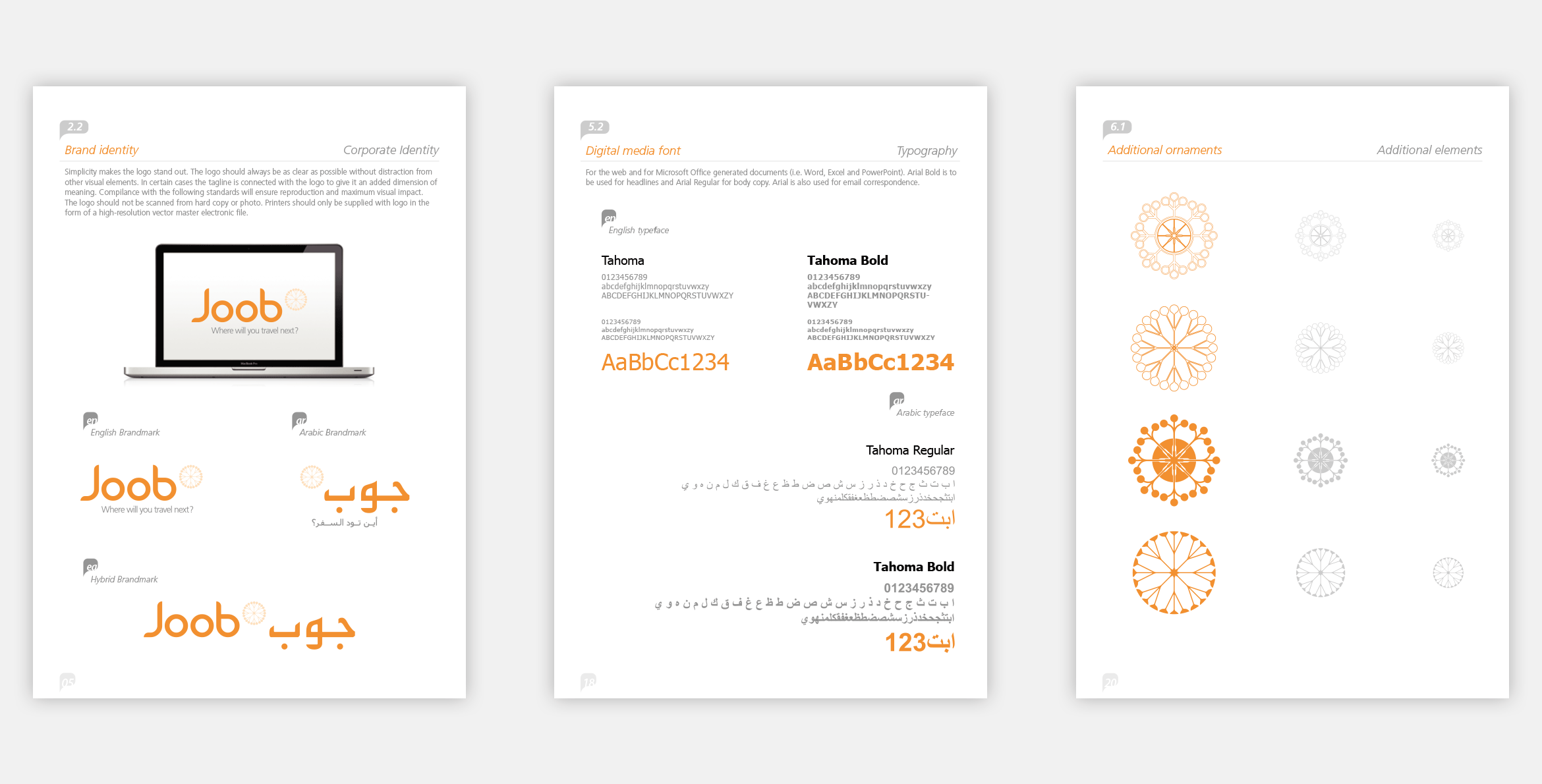
The Joob logo
The look and feel of the logo is very ‘arabic’. The typography of the word Joob has been created from a modified font. The tagline and its alignment predestinates your next journey by adding a dynamic impression and motion to the logo.
Thanks for watching!
Let's chat if this project is similar to the one
you’d like me to work on.
Get in Touch
More selected projects
Rotowatch
Product Design

Protected: TomTom Sports
Product Design
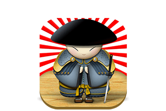
Jason O. Stevens
Web Design
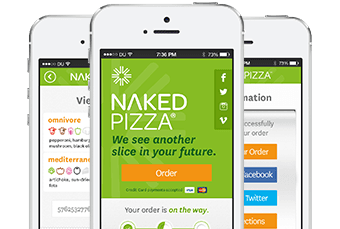
Naked Pizza
App Design
Joob.com
Branding
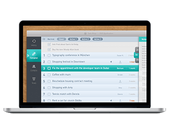
Task Ninja
App design
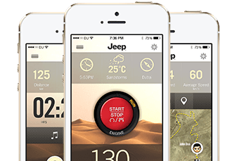
Jeep
App Design

Graph Concept
Data Visualization
Icon Lounge
Icons

Arabia Insurance
Web Design
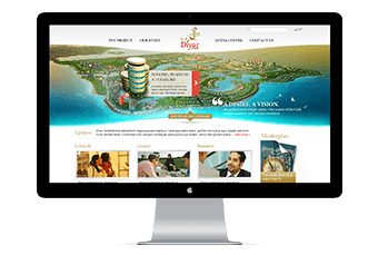
Diyar Al Muharraq
Web Design

Mercedes-Benz
Web Design
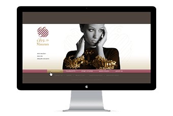
Mauzan Fashion
Web Design
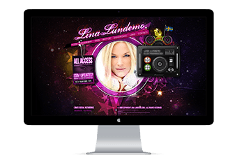
DJ Lina Shine
Web Design
Stimulus Vibrations
Artworks